Ever noticed how most speech therapy rooms are colorful and full of energy, yet the apps therapists use feel cold and cluttered? That disconnection creates real problems during sessions.
Speech therapy design should mirror what happens in sessions: therapists move quickly, kids concentrate better, and the interface shouldn’t slow anyone down. So when the design feels natural, therapists are more likely to stay focused on the child instead of the technology.
In this article, we’ll show you how you can use thoughtful mobile UX design to support speech therapy and create smoother sessions with happier clients.
First, we’ll look at how speech therapy room design can influence mobile app UX.
How Speech Therapy Room Design Inspires Better Mobile App UX
Speech therapy room design uses color, organized spaces, and simple layouts to inspire mobile apps that feel intuitive and engaging.
Let’s look at how you, too, can use these room designs to create a better mobile user experience.
What the Speech Therapy Room Teaches Us
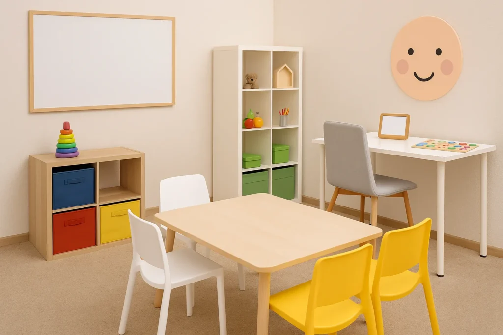
Walk into any good speech therapy room and you’ll notice that everything has a place. The calming colors are there to reduce distractions and provide visual cues to show kids what to do next.
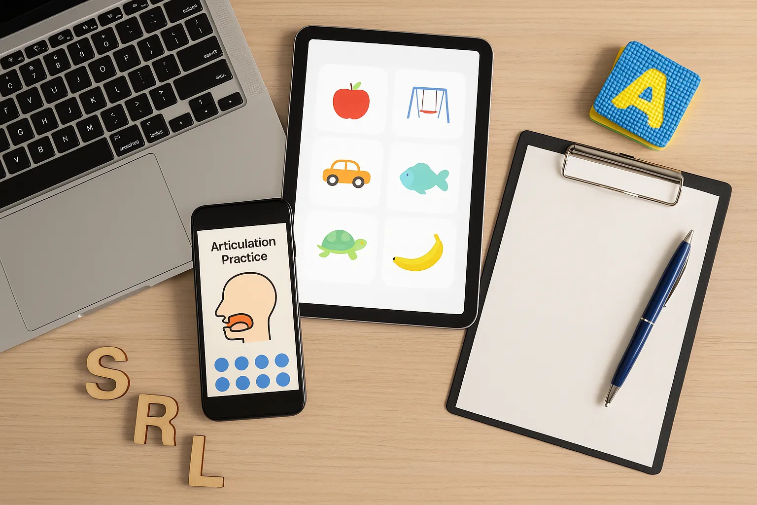
Speech room decor helps provide a structure to help kids feel safe and focused. Mobile apps can do the same thing by using familiar design elements, like clearly labeled buttons, progress bars, and color-coded sections that help users move through activities easily.
Visual Cues and Functional Decor in App Layout
In a therapy room, you might see labeled bins or color-coded stations. A similar concept shows up on mobile as buttons, icons, and simple navigation.
We notice that there’s usually less confusion when users can see where they are in a session. This type of clear visual cues shows both therapists and kids what to do next. The easiest method is to keep the most important content (like current activity, progress bar and session timer) front and center.
Designing for Dual Users: Therapist and Child
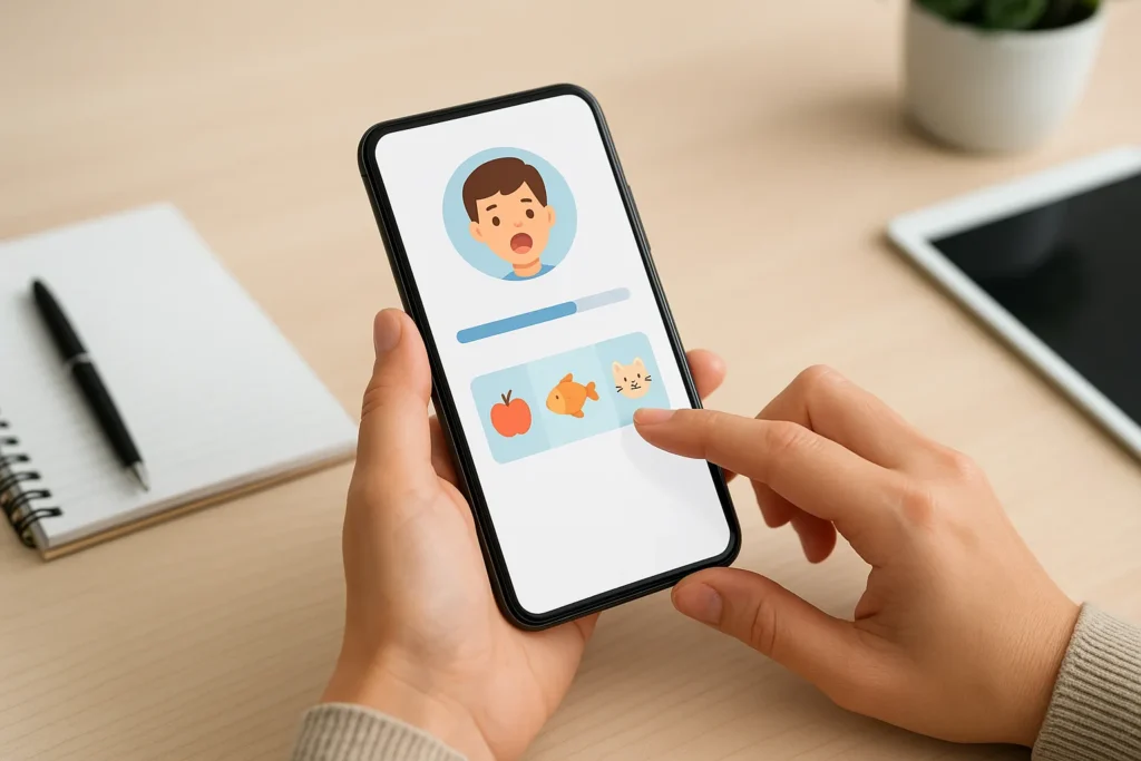
Here’s the challenging part: speech therapy apps must serve two different audiences at once. The therapist needs quick access to settings and data, while the child needs big, engaging buttons and instant feedback.
The app should allow therapists to control what children see while keeping essential tools accessible with a single swipe. But once therapists and kids can find what they need, you might wonder if they’ll actually want to use it.
The Importance of Mobile UX Design in Speech Therapy
Mobile UX is just as important since kids won’t engage with boring interfaces and therapists can’t waste time on confusing menus. Good mobile app UX can keep sessions productive and fun.
Here’s how to make that happen in real therapy settings.
Mobile UX Design Importance in Therapy Settings
Speech therapy sessions last maybe 30 minutes and even then, the kids get distracted. On top of that, the therapists need to track progress, switch activities, and keep energy high all at once in these brief sessions.
So if the mobile app user experience is clunky, those precious minutes disappear fast. Then the kids start losing focus as they watch the therapist struggle with confusing menus or frozen activities. We’ve seen many sessions fall apart like this.
How Mobile Screens Differ from Desktop App Expectations
You’ve probably held your smartphone in one hand while doing other tasks at the same time.
Now imagine needing to free your other hand just to tap a button. Wouldn’t it be easier if it was always within easy reach of your thumb? Absolutely! You might not appreciate it right away, until you run into the problem we just mentioned.
This is why some therapists prefer split screens. Your mobile UX design has to match how these people actually use their mobile phones during real therapy sessions.
Keeping Children Engaged Through Smart Mobile App UX
Kids need instant feedback when they tap something, and bright animations, sounds, and progress bars tell them they’re doing well. These design elements can make therapy exercises feel like games.
From our experience, adult users also stay focused when the app responds instantly. So quick transitions, clear feedback, and small rewards keep everyone motivated.
Improving Mobile UX by Observing Speech Therapy in Action
The best UX design comes from watching real sessions and asking therapists what frustrates them. That’s why we recommend involving therapists from the start to test wireframes and prototypes early and adjust based on their feedback.

This section will explain why you should work with speech therapy professionals from day one.
Collaborating With Therapists from the Start
Most companies build an app first, then ask therapists to test it later. That approach wastes time and creates products nobody wants to use. So before typing a single line of code, bring therapists into the design process.
Start by observing actual therapy sessions to find workflow problems. Then ask therapists what slows them down and what features they rely on. This early input will be your guide for everything from placement to how data gets saved between activities.
Prioritizing What the User Actually Does
Here’s something we noticed right away: unlike casual users, therapists don’t explore apps freely; they rely on specific tools at specific moments. We recommend designing navigation around those tasks instead of just listing features in a menu.
Pro tip: Keep the most important content at the top of every screen. Progress tracking, activity selection, and session notes should all be one tap away to reduce scrolling and give therapists more time with kids.
Structure That Reflects the Session Flow
Therapists rarely do just one thing at a time during sessions. For example, they might review data while a child completes an activity or moves between games and note-taking. That’s why flexible layouts are so important.
We suggest using split screens for the therapist to see two items at once, or switching to horizontal views when the device rests on a table between the therapist and the child.
Design Speech Therapy Apps Therapists Want to Use
So, what do you think? Does your current app feel like it belongs in a real speech therapy session? If your app UX feels natural, you’re also helping therapists work more efficiently and avoid burnout. That means improved results for kids as well.
Want to see how thoughtful mobile UX design can improve your therapy practice? Check out our program at Smarty Ears.